Mirage
A brand and packaging system designed to position Mirage as a more elevated and retail-ready home decor offering.
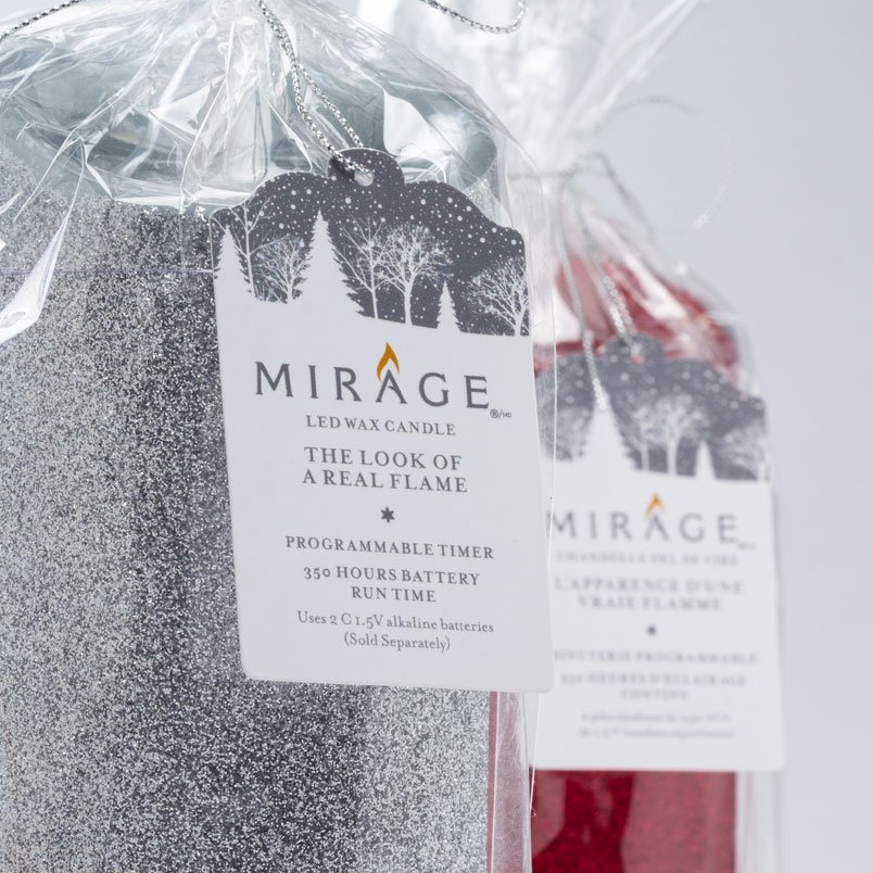
Mirage is centred on shaping a clean and elegant brand presence for a flameless lighting product inspired by the warmth of candlelight. The work spanned identity, packaging, and production-ready design to help the brand feel more at home in a range of decor retail settings.
MY ROLE
Brand direction, identity system development, packaging architecture, and production-ready design execution.
CHALLENGE
The brand needed to present a technology-led product in a way that still felt warm, refined, and appropriate for home decor retail.
APPROACH
I translated the product idea into a visual system that balanced elegance with clarity, carrying the brand language from logo through packaging while keeping the presentation flexible enough for different retail environments.
OUTCOME
The result was a more cohesive brand presence that made the product feel more polished, giftable, and retail-ready.

CONTEXT / OVERVIEW
Mirage was developed as a flameless lighting product for the home decor space. The work needed to balance product function with a stronger emotional and visual presence, helping the brand feel more refined, more giftable, and more adaptable across retail settings. The focus was not only on creating a polished identity but also on building a cohesive system that could carry over to packaging and printed touchpoints.
KEY DECISIONS / STRATEGIC NOTES
Translate candlelight warmth into a cleaner visual language.
Balance premium cues with packaging clarity.
Build a system that can work across different retail environments.

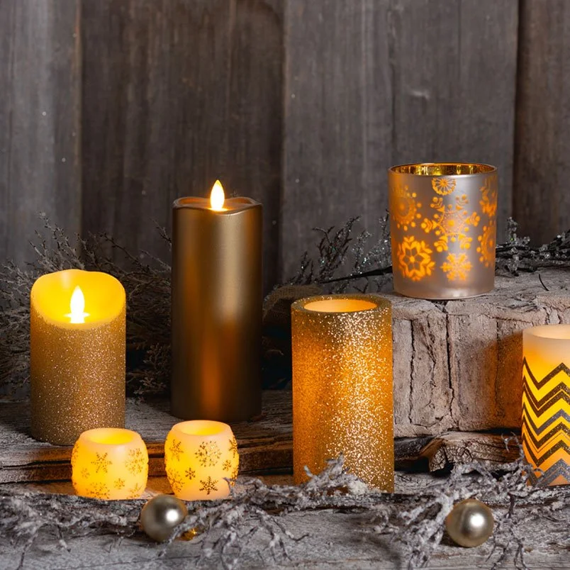
Positioned the brand to feel more aligned with contemporary home decor retail.
Extended a consistent visual language from logo to packaging.
Balanced warmth, elegance, and shelf clarity across touchpoints.

Looking to reposition a product or build a stronger brand system? Let’s connect.